Out of Sorts/All Sorted Out
– Out of Print –
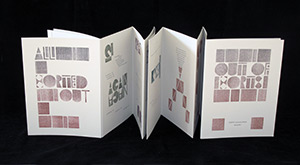
The 1000-year history of type manufacturing is full of surprises. In China and Korea, movable type was developed in clay, wood and other materials hundreds of years before Gutenberg’s famous printed Bible. Recent investigations at Princeton University have even cast doubt on Gutenberg’s hand mould process, showing evidence of a different method of casting type. Although European methods for metal typecasting of Arabic type were developed within 65 years of the publication of Gutenberg’s Bible, Islamic countries did not allow books printed in metal until the 19th century: the calligraphic tradition was strongly supported by the state. Type for computers today continues to be made by “typefoundries,” though the methods are programmatic rather than carved punches hammered into a copper matrix for casting. After students researched type manufacturing history, it seemed reasonable to ask them this semester to design and carve their own movable type in cherry wood. To keep it simple and direct, two prints made by lettering artist Hans Schmidt in the 60s were brought in as models for a highly geometric typeface. The proportions were modified to reflect the eight width groupings of the Trajan Column capitals in Rome. Letters not in Schmidt’s prints needed to be designed. Carving commenced and continued throughout the semester as new letters were needed for the book. We often found ourselves out of sorts. We purchased Fontographer so that a sub-group of four students could digitize the type from the drawn and carved forms. A variety of experiments with the type could now be made into plates for printing. The experience of designing a typeface and manufacturing it in class proved time-consuming, painstaking, exhilirating, and ultimately rewarding. Fourteen students in the Typography and the Book Arts class at Scripps College designed and produced this book by letterpress on four Vandercook presses. The wood type was carved into cherry and digitized by the students, who named it NeoSchmidt, after the lettering artist Hans Schmidt, whose prints they studied. The accompanying metal type for the text is 12 pt. Gill Sans. The book was printed on gray Rives BFK. The book slips out of its simple binding for display. Size: 9″ x 12″ in an edition of 103 copies.
Order a Book from Scripps College Press
If you would like to purchase a copy of the books or broadsides, please send a check, payable to the Scripps College Press, to the address below. Please add California sales tax of 8.75% if book is in stock, and a shipping fee of $12.00 per book.Become a Patron
If you wish to become a standing order patron, you will receive 20% off the list price of the books and will receive each book immediately after it is completed. We complete a collaborative book each semester. Please indicate with your order if you wish to become a subscriber.Scripps College Press 1030 Columbia Ave. #2025 Claremont, CA 91711 Attn: Tia BlassingameIf you would like more information, please call (909) 607-3866.
| Previous: Ad Libitum | Next: Rock · Paper · Book |